Redesign of St. John Ambulance NSW website

OVERVIEW

During a 4-week design challenge, our team redesigned the St. John’s Ambulance NSW website to enhance the course booking flow and support their mission.

St. John's NSW is a not-for-profit organization in New South Wales, Australia that provides first aid training and services.

During a 4-week design challenge from, our team focused on redesigning the St. John’s Ambulance NSW website to improve their course booking flow and to support their mission.

As a result, we secured the 5th position among 27 participating teams.

TEAM

Meghalee, Lynn Teoh, Patricia Namara

MY ROLE

Contributed to the overall process and focusing more on the UI design such as ideation, website audit, wireframes, high-fidelity designs and prototype.

FINAL DESIGNS

FINAL DESIGNS

FINAL DESIGNS

Video - Redesigned proposed booking flow

Design components

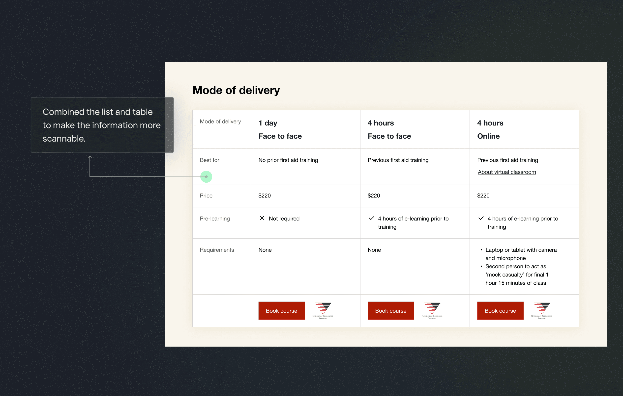
Selecting mode of delivery

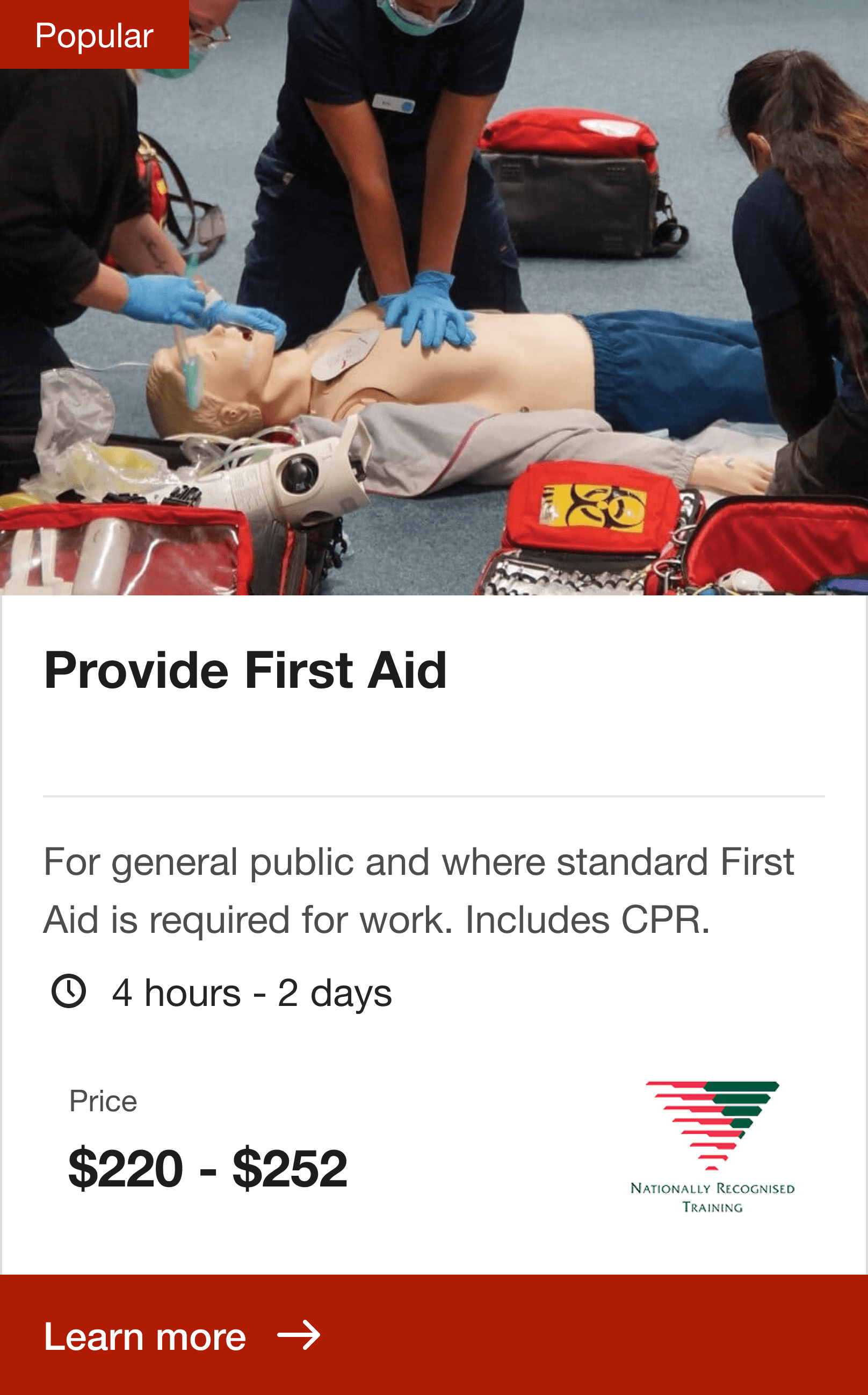
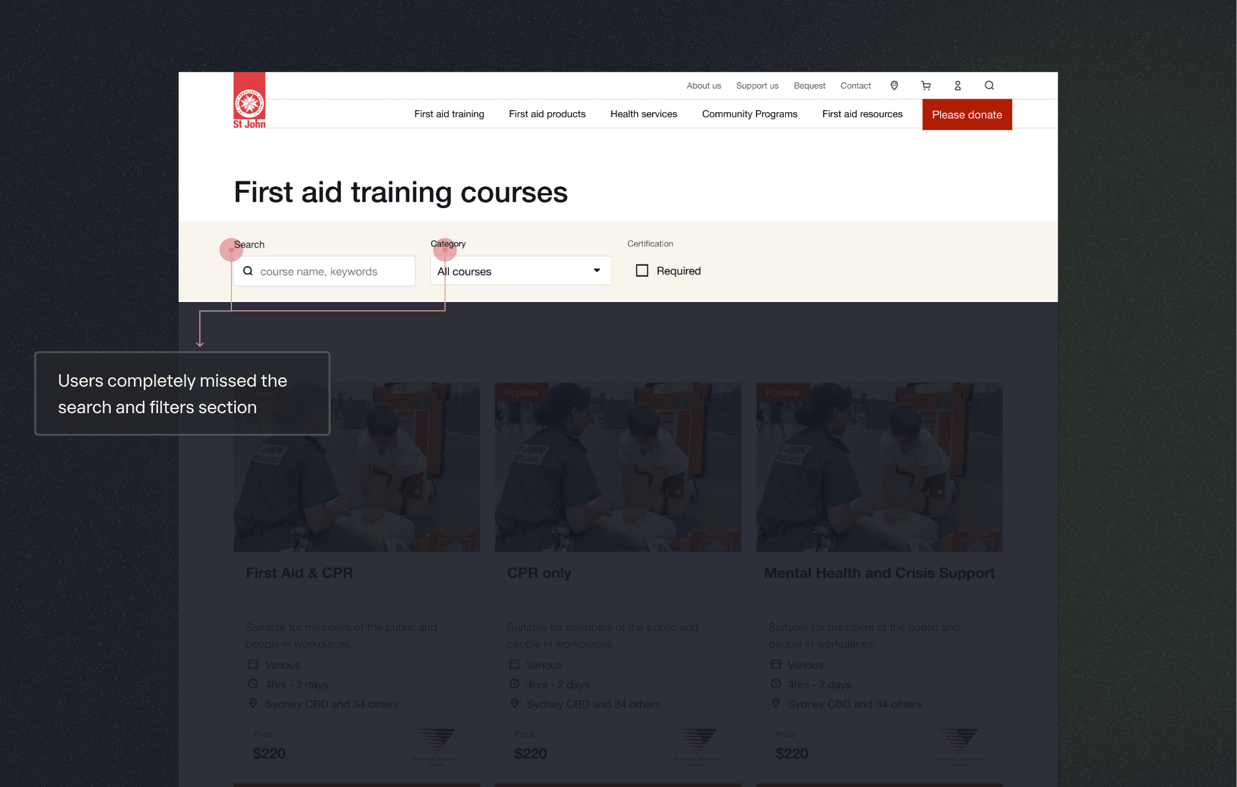
Finding suitable courses

RESEARCH INSIGHT

St. John's NSW customers faced difficulties in selecting suitable courses and contacted the organization for help.

During the preliminary usability test on the St. John's NSW website, it was discovered that users were facing challenges in finding crucial information such as course prices, pre-requisites, and other relevant details necessary for making informed decision.


Two other significant friction points were identified as well, which contributed to users losing confidence in the website’s usability.

Struggled to find the appropriate course because the current categorisation was ineffective in finding a course

Struggled to find the appropriate course because the current categorisation was ineffective in finding a course

Struggled to find the appropriate course because the current categorisation was ineffective in finding a course

Trouble in deciding the delivery mode because users didn’t know which was appropriate for them

Trouble in deciding the delivery mode because users didn’t know which was appropriate for them

Trouble in deciding the delivery mode because users didn’t know which was appropriate for them

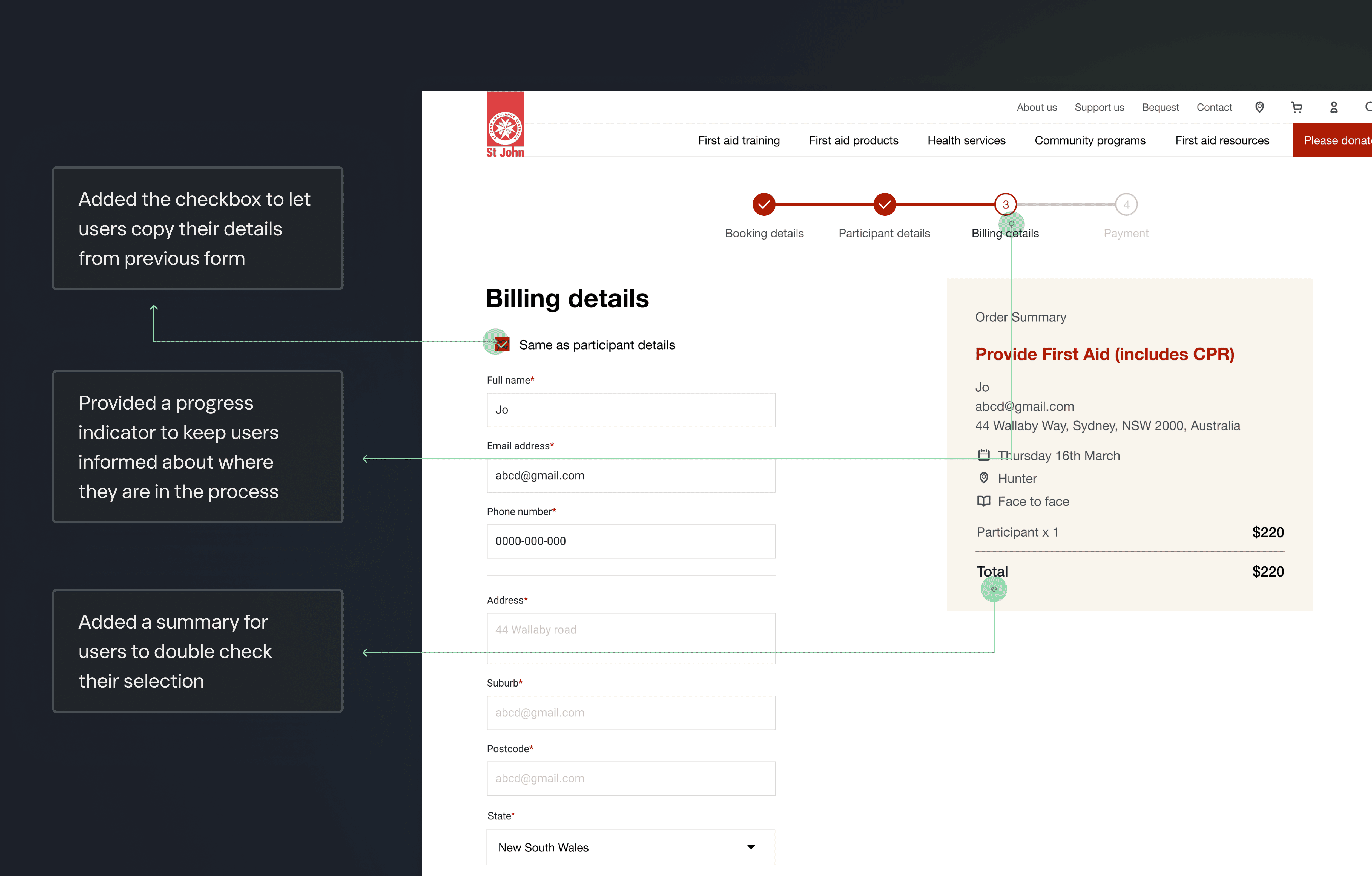
Lengthy and complicated billing process as they had to input the same information multiple times

Lengthy and complicated billing process as they had to input the same information multiple times

Lengthy and complicated billing process as they had to input the same information multiple times

SITE AUDIT SUMMARY

As my team delved into the usability study and competitive analysis, I conducted a site audit to identify further usability issues specifically related to the booking flow.

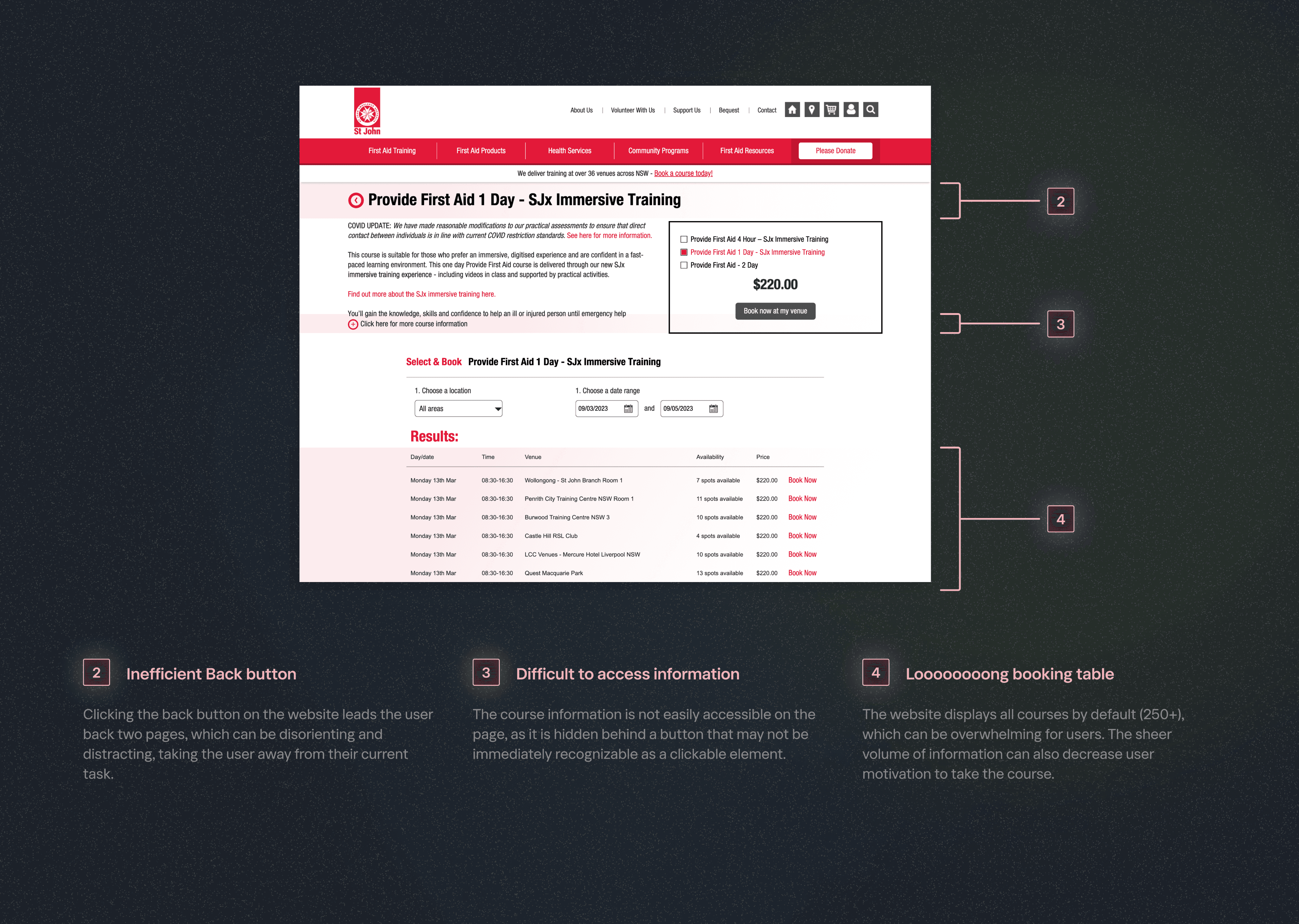
Broken links to a course’s details page not allowing them to get the information they need

Broken links to a course’s details page not allowing them to get the information they need

Broken links to a course’s details page not allowing them to get the information they need

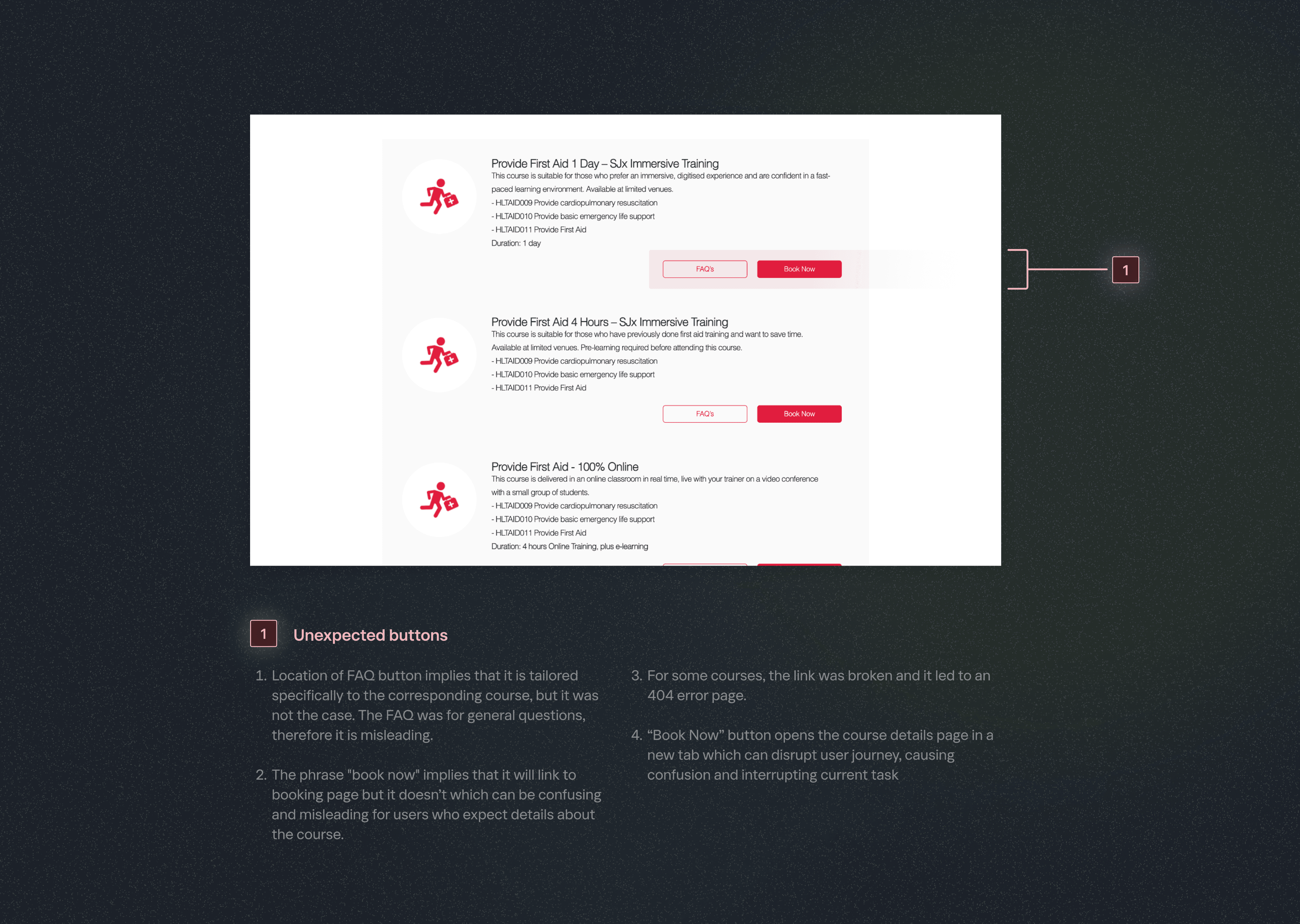
Buttons not performing as expected disrupting their journey to book an appropriate course

Buttons not performing as expected disrupting their journey to book an appropriate course

Buttons not performing as expected disrupting their journey to book an appropriate course

Non-intuitive navigation for finding relevant information they needed to make a decision

Non-intuitive navigation for finding relevant information they needed to make a decision

Non-intuitive navigation for finding relevant information they needed to make a decision

Site audit - Course listing page

Site audit - Course details page

Site audit - Billing page

PERSONA

St John’s NSW received calls from people who needed a certificate for work.

We were able to confirm that St John’s received many phone calls from people who were required to get a first aid certificate for work, regarding the selection of first aid courses.

PROBLEM

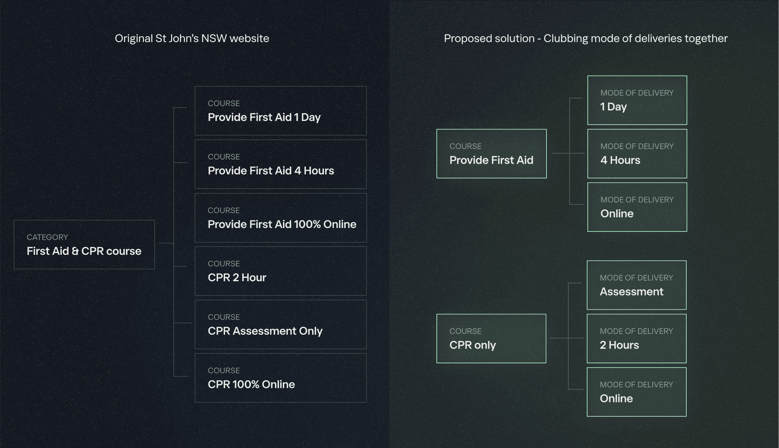
Streamlining the first aid course search

The usability test showed that St. John's NSW course categorization was ineffective, as users couldn't find the right course, and the card sort activity was inconclusive because users found it hard to categorize courses that didn't match their mental models.

PROBLEM

Streamlining the first aid course search

User search pattern for hard-to-find courses (Asthma & Anaphylaxis)

Proposed solution - First iteration

Usability study findings

Proposed solution - Second iteration

PROBLEM

PROBLEM

Building confidence in course selection

Building confidence in course selection

PROBLEM

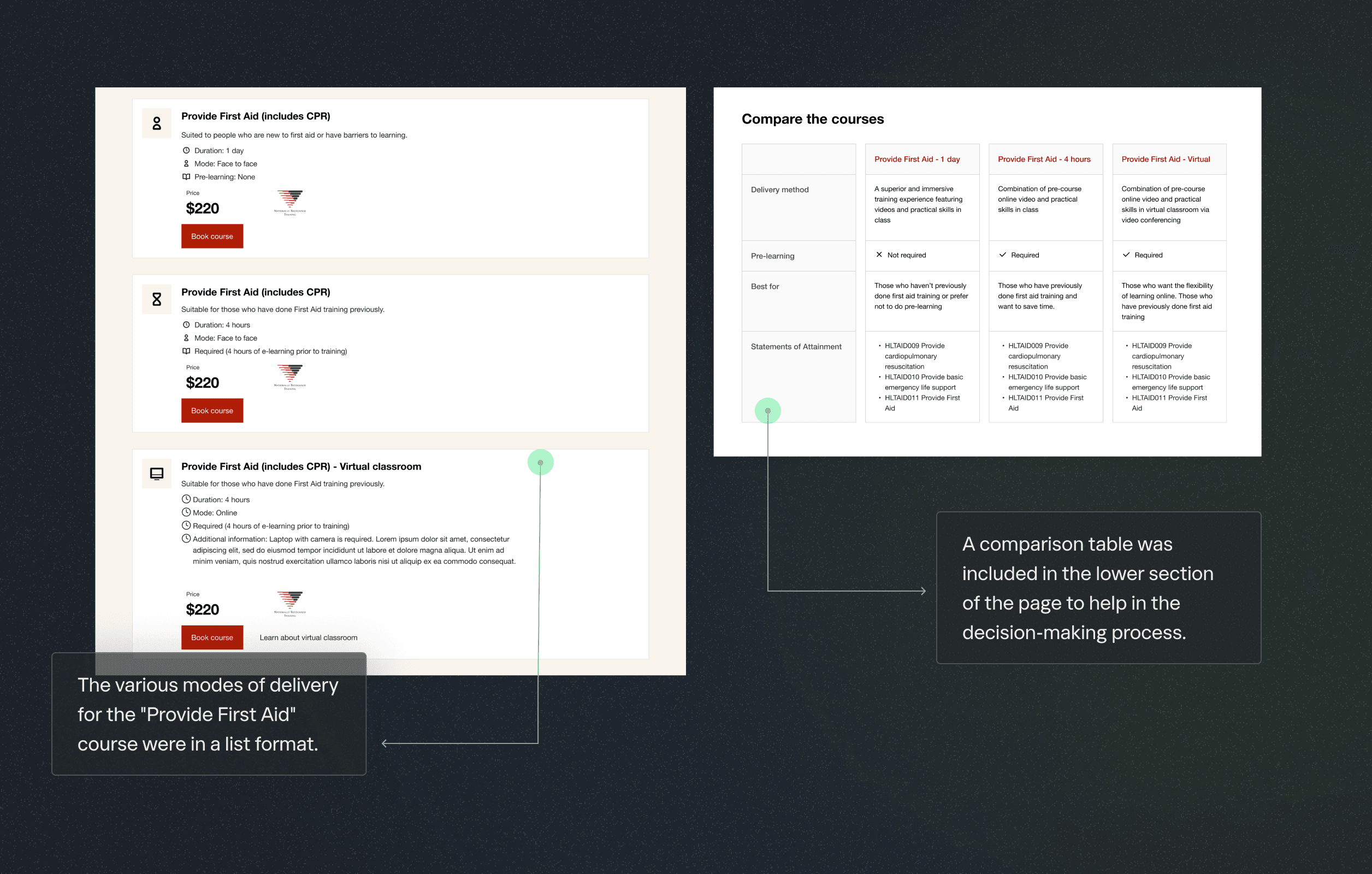
The usability test found that users were overwhelmed by numerous modes of delivery that looked alike, resulting in a lack of confidence in selecting the course that was suitable for them.

The usability test found that users were overwhelmed by numerous modes of delivery that looked alike, resulting in a lack of confidence in selecting the course that was suitable for them.

The usability test found that users were overwhelmed by numerous modes of delivery that looked alike, resulting in a lack of confidence in selecting the course that was suitable for them.

Building confidence in course selection

Pain points on course listing page

Proposed solution for categorization

Proposed solution - Final iteration

Proposed solution - First iteration

Usability study findings

Proposed solution for selecting mode of delivery of course

Simplification of billing process

Simplification of billing process

PROBLEM

During the preliminary usability test, it was discovered that users were frustrated with having to repeat their information in 3 different places (participant details, billing details, shipping details)

Pain points in the billing process

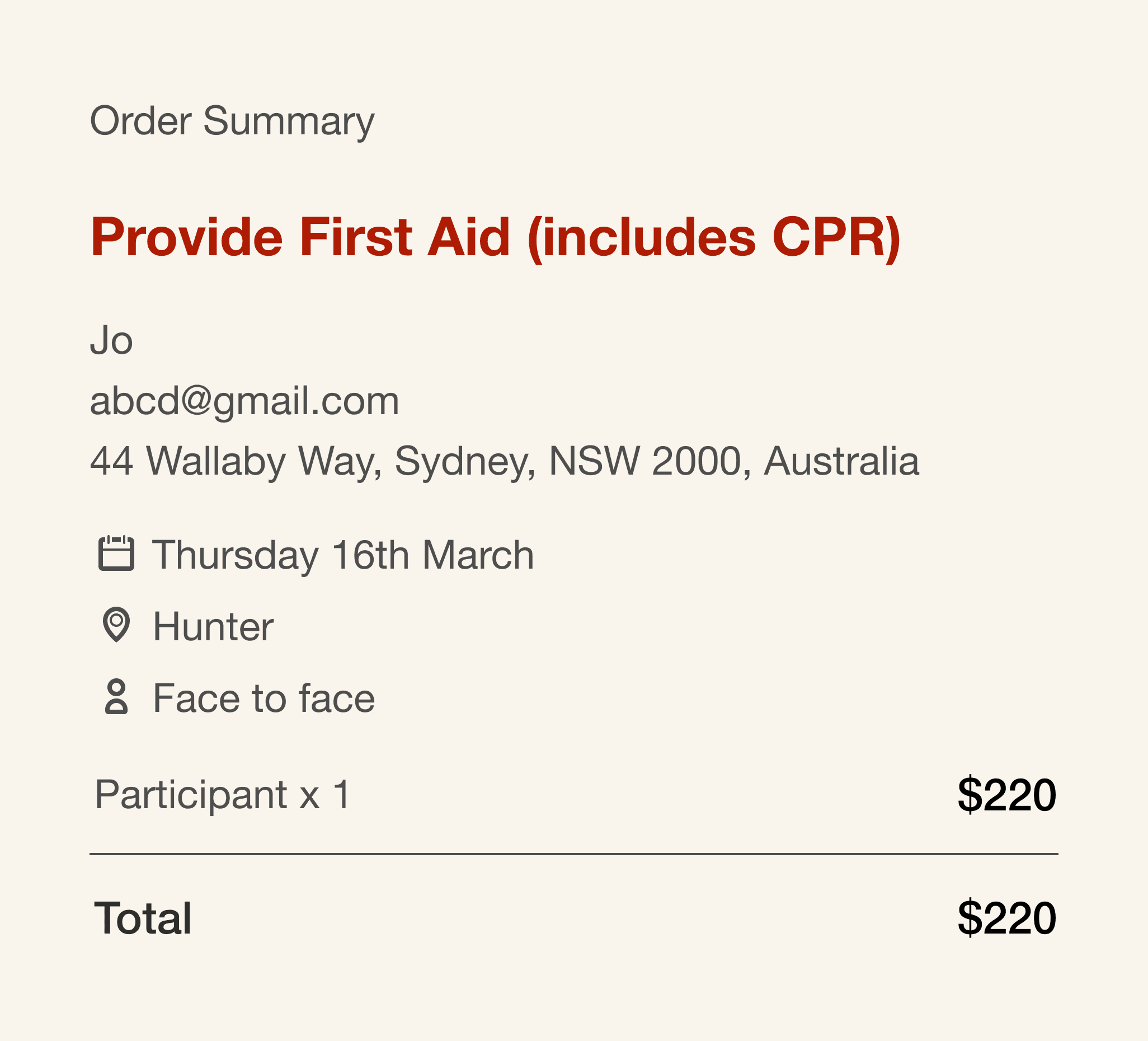
Proposed solution for the billing process

METRICS TRACKED

PROJECT TAKEAWAYS

Working asynchronously

Collaborating and getting insights from other designers and mentors while living in different time zones and bringing all our strengths was the highlight of this project for me.

Working asynchronously

Collaborating and getting insights from other designers and mentors while living in different time zones and bringing all our strengths was the highlight of this project for me.

Working asynchronously

Collaborating and getting insights from other designers and mentors while living in different time zones and bringing all our strengths was the highlight of this project for me.

Providing multiple pathways

Users take different routes to find what they want and don't hesitate to use search directly if needed, even if it means skipping other options.

Providing multiple pathways

Users take different routes to find what they want and don't hesitate to use search directly if needed, even if it means skipping other options.

Providing multiple pathways

Users take different routes to find what they want and don't hesitate to use search directly if needed, even if it means skipping other options.

Repeating details to provide assurance

Users wanted to make sure of their choices and get assurance before reaching the payment screen.

Repeating details to provide assurance

Users wanted to make sure of their choices and get assurance before reaching the payment screen.

Repeating details to provide assurance

Users wanted to make sure of their choices and get assurance before reaching the payment screen.

CHALLENGE

How can we support Jo in discovering the right course and instilling confidence for a smooth booking process on the website?